WELCOME

Hi You! Where were you yesterday?
Welcome to my blog showcasing works, ability doing what I love to do.
When visiting this blog,relax, take your time & support us by placing your comments or poll on the right.
So, don't just leave without sharing your thoughts, your opinions are greatly appreciated..
Have a nice day! :)


Cuppa Product: Baby

Monday, July 14, 2008

Blue Pacific, processed fruits product

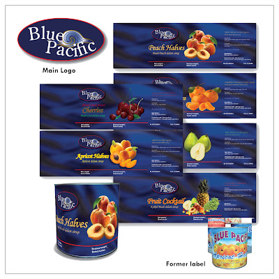
Blue Pacific project was completed recently this year. I was basically called up to wave a magic wand on the poor old design.

The product is a processed fruit brand mainly catering to industrial consumers; such as hotels, bakeries, cakeries and local pastry makers.
I created the product with new logo (which originally it didn't have), just to devise the product with a stronger branding characteristic.
The label based on client's request to potray the name literally : ‘Blue Pacific’. Having that in mind, so I did a breezy background, just to be a little more subtle but representative with the ocean theme. The choice of typefonts and colors were predominatly also applied in keeping with the theme.
I've received a lot of positive feedbacks on this design project. Well, it's rewarding when people love your work, especially the client.
Comparable with the old design and client's satisfatiction factors, I think I'm pleased with my work.
What do you think?...Have your say..

Koji, Processed Cheese product

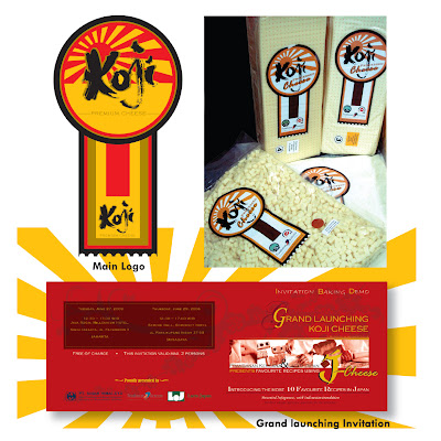
Koji is a processed cheese product originated from Japan. When client requested for a label with unusual approach, the label was designed with irregular shape featuring an emblem-like shape. It functions both as an information label and closure for the vacuum plastic packaging.

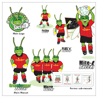
Grasshopper Soccer Club - one most enjoyable design I did!


Grasshopper Soccer Club (GHS) is a franchise business running a children’s soccer club based in Perth, Australia.
Founder of GHS club required an update look for the logo and mascot of the club, yet still keeping the important message of the old design.
Since adults (parents) are the main objective of the business, factors such as fun, excitement and professionalism are key to the success of the project.

Friday, July 11, 2008

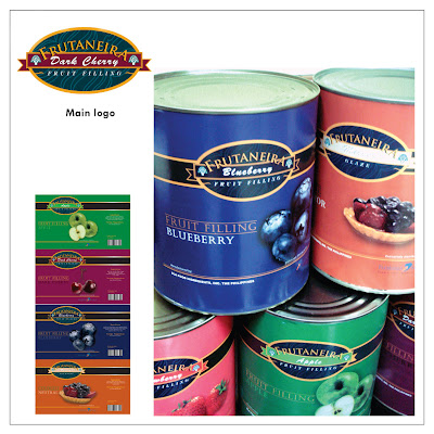
Frutaneira - Processed fruits product


Fruitaneira is my first commercial project completed for local company.
This project is one of my early well-done works which tail to the next projects.
There were bitter sweet times completing this particular project, as it wasn't easy for me to convince client with 'tasteful' artwork when their mindset is conventional and rather stubborn.
You know, the kind of people who is so bogged down with their own idea of aesthetics?
By experience, learning from working in the industry where objectivity of what looks good or what not is sensitive, I was taught to work the skill of blending the magic potion to blow clients away with the so called professionalism. Just do it right, when they are pleased, then you are on the right track.
Moving on with the project, the product needs a label to be designed to represent the fruit fillings inside the can. Strategically, the goods hold the standard of European quality processed fruit products. I created new logo to apply branding standard and built the concept, which was based to convey elegance and conservative quality for buyers to capture.
I aimed at maintaining both logo and illustrations to go hand in hand between 'classy' and 'classic'... as a combo :)
I'm opened to opinions and comments...
Have your say...

Cuppa studio premier flag


Hi, Cuppa studio is setting up its premier flag.

I'm the person behind the knick knack of the studio.
We creates illustrations, branding, marketing collaterals, packaging to the nitty grity of the projects.


We don't pick design projects, you pick us!
Check out Cuppa studio latest commercial works!
Left are commercial logos we have completed previously.