WELCOME

Hi You! Where were you yesterday?
Welcome to my blog showcasing works, ability doing what I love to do.
When visiting this blog,relax, take your time & support us by placing your comments or poll on the right.
So, don't just leave without sharing your thoughts, your opinions are greatly appreciated..
Have a nice day! :)


Cuppa Product: Baby

Tuesday, November 11, 2008

Developing the right creative flare for the brand


For those of you whom have familiarized with my blog, you will immediately recognized the cartoon character displayed on above, playing the"PR" role for the company. After being on hold for a year, he is now ready to take his lead which I have developed him for!


The business concept behind the sports based franchise company is pretty "healthy", what the company need as a lifestyle business is however a strong brand image which is recognisable, fresh and lingering to prospect customers' mind. It must have the ability to create trend which eventually promote better living and positive attitude.


These underlying basis lead to the development of the unique brand applying to its id's, products/merchandises and variety of marketing& sales tools. A well rewarded project. Look forward for the next fantastic works!

Monday, September 22, 2008

On Vacation

I will be leaving for a month, I'm feeling abit weary about this whole journey, I do hope I will have some great times considering the extra miles away I'm gonna have to suffer myself in the plane. I will miss a lotta things within this one month... really... really... gosh, I need to relax...get some good sleep while I can rest all of the burden to the lapse of time. I guess, only time will proof my anxiety correctness.

Im going on vacation!!! for G sake. Cmmon! I need some serious excitement booster... alrite' fella, im showing some personalities as im freakin out today...tht's fine, i supposed im no uber cool chic all the time, ...need to get thangs ready now... i'll send some love postcard later!

hasta la vista....

Wednesday, September 17, 2008

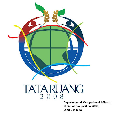
Land use national logo competition 2008


Hey, hey... the national holiday is coming soon, in fact I will be taking vacation earlier than the rest of people in the country :)...


Btw, I want to scoop out new stuff I have completed. I hope you enjoy reading the story behind it. Here you go...

Department of Occupational Affairs, Republic Indonesia (RI) organized Land Use logo competition for celebrating The World’s Land Use Anniversary 2008, I enter one in to participate the national event. The concept essentially capturing the spirit of human living space interacted and surrounded by the ocean, the environment and urban landscape. The establishment of industry, agriculture, residential district, commerce and infrastructures brought us to the reality of massive effect the urban development causes to our planet earth. The logo encourages the awareness of balance and care of the land use, we can then keep preserving its existance for the future generations.


I'm still waiting on the result though, so wish me luck! Happy holiday y'all

New project! Kallista Alam


Finally, I'm happy to publish yet another exciting project. It's been a while since I wrote, the economy slows down and it's taken its toll to small business effort alike, like mine :P... but it's great to get my creative juices going again for this entirely new work.The vice director, whom by the way is a budding young entrepreneur, gave me the chance to build a new look for his father's oil (CPO) company. The old logo, to me looks traditional, although, it is believed to have several strong philosophy behind it. I did came up with several fresh design concepts based on the nature of the business. And I pursued him to take the plunge to go for new image. However in respect to company's values & traditions, as a designer, I ought to obey my client requirement.I redesign the monogram so that it looks more modern aesthetically, and also to be more symbolic representing the key business of the company, which is bio oil. Although my personal taste prefers one of the alternative concept for the company to have, I guess what matters is client's satisfaction. Bottom line, that is the moral of the project.
Cheers! I'll see you again on the next chapter.........peace

Monday, July 14, 2008

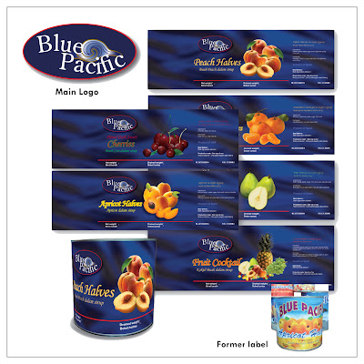
Blue Pacific, processed fruits product

Blue Pacific project was completed recently this year. I was basically called up to wave a magic wand on the poor old design.

The product is a processed fruit brand mainly catering to industrial consumers; such as hotels, bakeries, cakeries and local pastry makers.
I created the product with new logo (which originally it didn't have), just to devise the product with a stronger branding characteristic.
The label based on client's request to potray the name literally : ‘Blue Pacific’. Having that in mind, so I did a breezy background, just to be a little more subtle but representative with the ocean theme. The choice of typefonts and colors were predominatly also applied in keeping with the theme.
I've received a lot of positive feedbacks on this design project. Well, it's rewarding when people love your work, especially the client.
Comparable with the old design and client's satisfatiction factors, I think I'm pleased with my work.
What do you think?...Have your say..

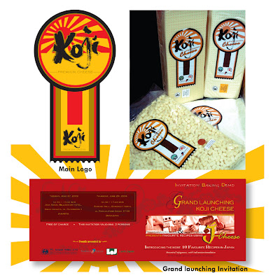
Koji, Processed Cheese product

Koji is a processed cheese product originated from Japan. When client requested for a label with unusual approach, the label was designed with irregular shape featuring an emblem-like shape. It functions both as an information label and closure for the vacuum plastic packaging.

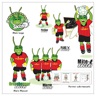
Grasshopper Soccer Club - one most enjoyable design I did!


Grasshopper Soccer Club (GHS) is a franchise business running a children’s soccer club based in Perth, Australia.
Founder of GHS club required an update look for the logo and mascot of the club, yet still keeping the important message of the old design.
Since adults (parents) are the main objective of the business, factors such as fun, excitement and professionalism are key to the success of the project.

Friday, July 11, 2008

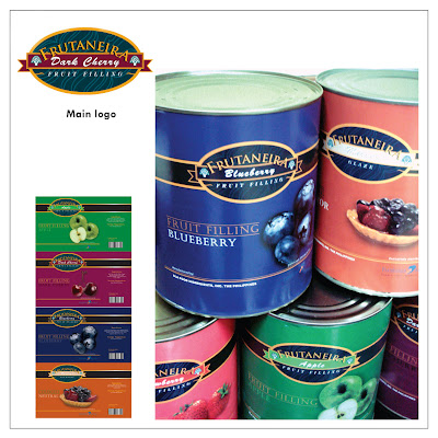
Frutaneira - Processed fruits product


Fruitaneira is my first commercial project completed for local company.
This project is one of my early well-done works which tail to the next projects.
There were bitter sweet times completing this particular project, as it wasn't easy for me to convince client with 'tasteful' artwork when their mindset is conventional and rather stubborn.
You know, the kind of people who is so bogged down with their own idea of aesthetics?
By experience, learning from working in the industry where objectivity of what looks good or what not is sensitive, I was taught to work the skill of blending the magic potion to blow clients away with the so called professionalism. Just do it right, when they are pleased, then you are on the right track.
Moving on with the project, the product needs a label to be designed to represent the fruit fillings inside the can. Strategically, the goods hold the standard of European quality processed fruit products. I created new logo to apply branding standard and built the concept, which was based to convey elegance and conservative quality for buyers to capture.
I aimed at maintaining both logo and illustrations to go hand in hand between 'classy' and 'classic'... as a combo :)
I'm opened to opinions and comments...
Have your say...

Cuppa studio premier flag


Hi, Cuppa studio is setting up its premier flag.

I'm the person behind the knick knack of the studio.
We creates illustrations, branding, marketing collaterals, packaging to the nitty grity of the projects.


We don't pick design projects, you pick us!
Check out Cuppa studio latest commercial works!
Left are commercial logos we have completed previously.